
Prague, 29 June 2022 – WOOD & Company, a leading investment bank in Central and Eastern Europe, is changing its visual identity. The new identity is intended to clearly support the WOOD & Co.’s key attributes – confidence, experience, stability and growth. Over the coming months, WOOD & Co. will launch a new visual identity, website, client portals and other formats that present the firm to the public.
"The market has changed significantly over the past 30 years. And while we sometimes refer to ourselves as a bit of a dinosaur in terms of our approach with clients, we are moving with the times. We have a track record to uphold, and a number of successful projects that give our brand respect and credibility. In recent months, we have been creating new investment opportunities, aimed at a wider clientele. The time is ripe for change. Our new identity better describes who we are and where we want to go. I believe it will support a more modern brand perception," says Vladimír Jaroš, CEO of WOOD & Company.
"New directions do not emerge by following old rules. In the financial world, courage, boldness and soundness have always won out. Our new identity reflects both our values, as the founders, and those of the company. Our new identity evokes emotion, and is ambitious and bold, and that is exactly what we need at the moment. I believe it will help us to strengthen our image as a strong player on the market," adds Jan Sýkora, WOOD & Company co-founder.
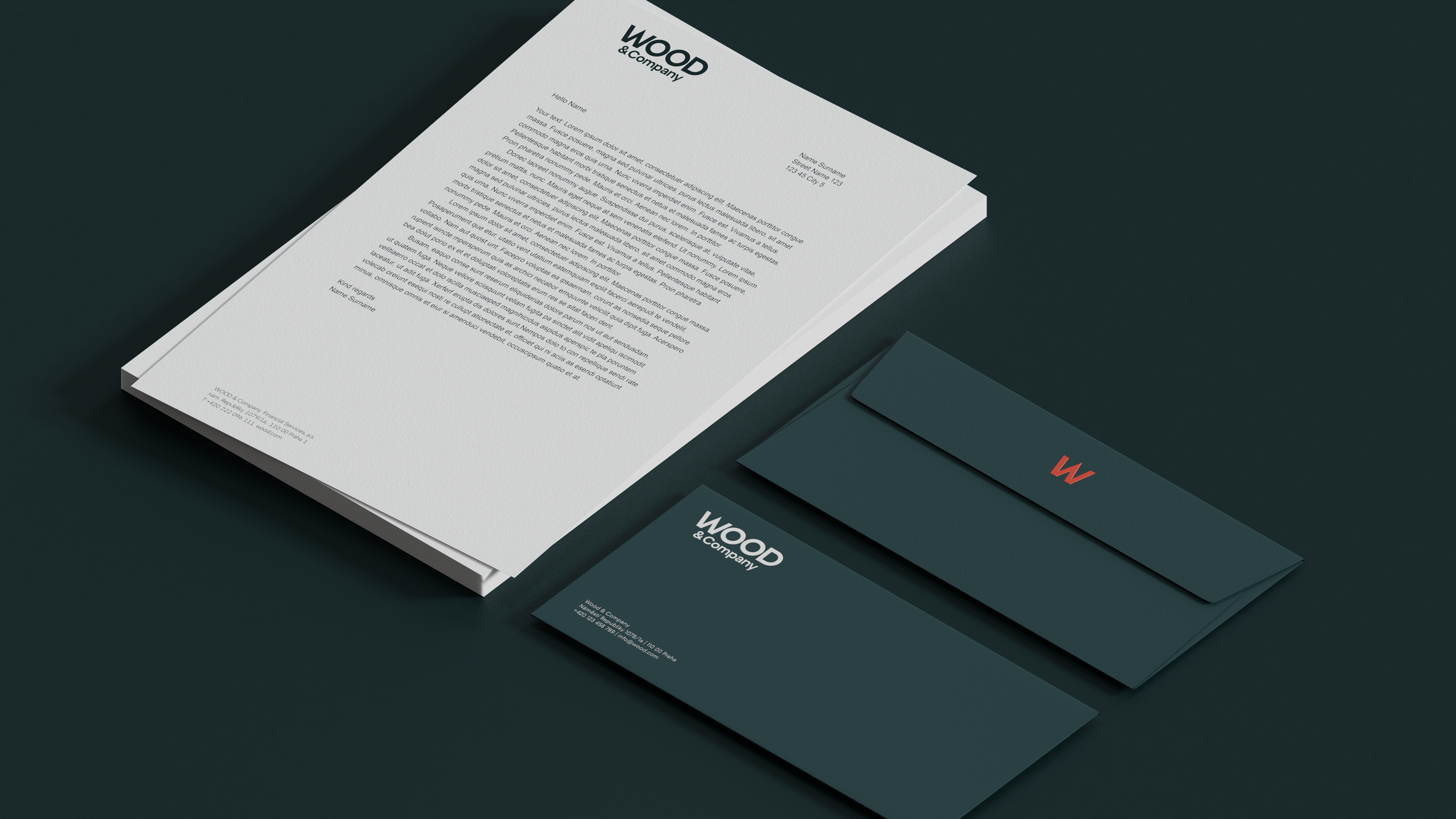
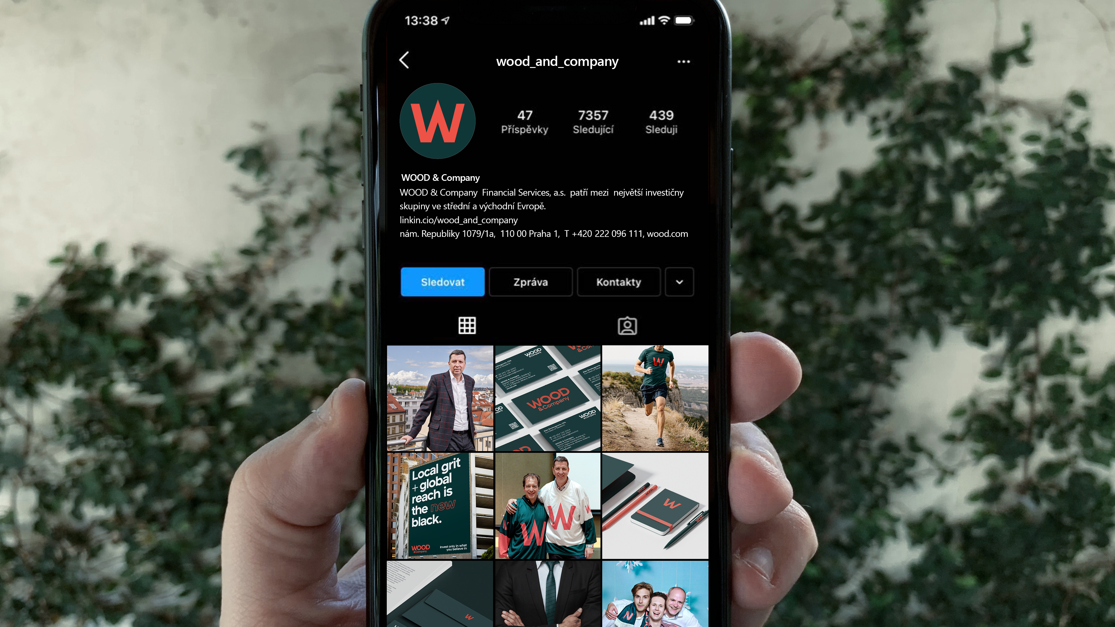
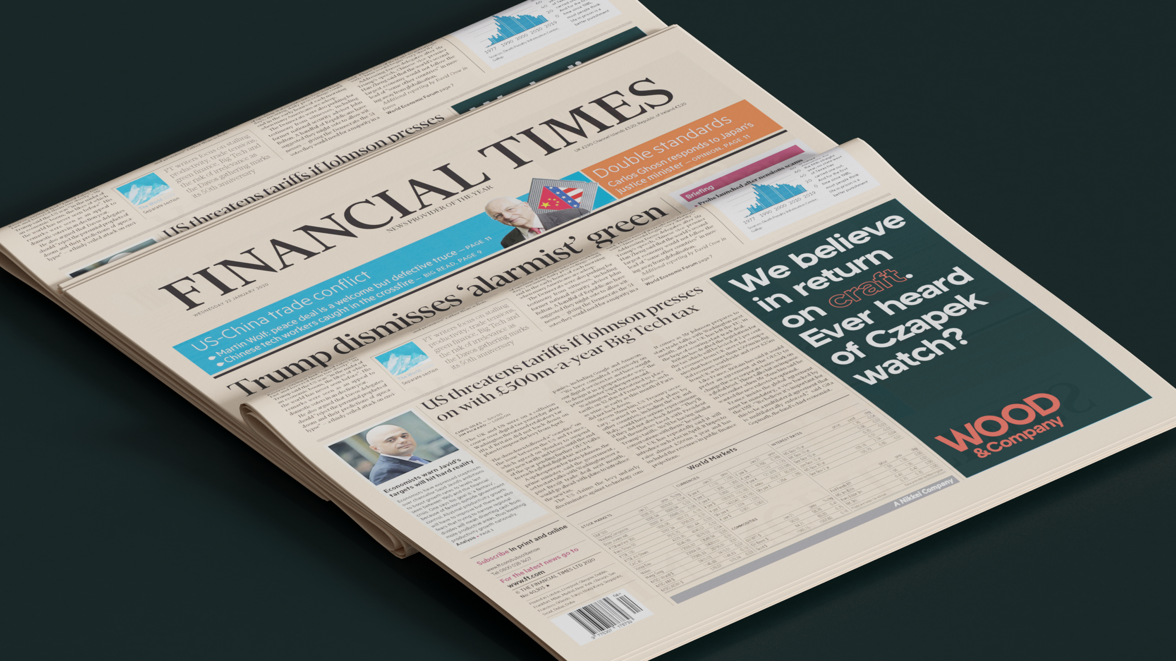
Our new logo is dominated by the red WOOD lettering, supported by a sharp centre letter W. "The inspiration for this work came from strong words, such as confidence, growth and stability. We drew on some of the fragments of the original logo, keeping the hierarchy of the main word "WOOD" and the complementary "& Company" on the second line. We changed the original footer font to the modern grotesque Atyp Bold by typefoundry Suitcase, which prepared this bespoke typeface for WOOD. We modified the original green to give the brand a more sovereign expression, and the rich red gives the new style a modern energy," adds Jonatan Kuna from Najbrt Studio, the studio behind the new branding, on the genesis of the logo. The distinctive graphic element of the new identity is the symbol 'W'.
WOOD & Company is one of the largest securities traders in Central Europe. It has a strong client base among institutions and large foreign banks. In recent years, the group has begun to open up to a wider clientele and expand in the asset management sector. Successful projects include the listing of Pilulka on the Prague Stock Exchange, the opening of thriving real estate funds, and the launch of the first robo-advisory platform, Portu. With 140,000 clients and more than CZK 10bn under management, it has become the largest online investment platform in Central Europe. This year, WOOD & Company also launched the first SPAC on the Prague Stock Exchange, and will continue to expand its range of investment products.
WOOD & Company is also responding to the gradual change in business strategy by modernising its approach to marketing and changing its visual identity. It is moving from a very conservative visual style to modern and confident branding. This is complemented by our bold claim: "Invest only in what you believe in", which reflects the company's DNA. "At WOOD & Company, not only is it standard practice for the three owners to put their personal finances into their own products, but also often our employees, who create the investment products for clients. Why? Because we believe in our products. If the client makes a profit, we make a profit; if the client loses, we lose," explains WOOD & Company's marketing manager, Veronika Holíková.
A great example of the synergy of using the new logo in practice is the introduction of the new identity to WOOD & Co.’s employees, which took place at the beginning of June. Employees received a Sequent watch with the new WOOD & Company branding as a gift from the company’s management. The gift is linked to an internal team competition across WOOD & Co.'s offices for the most steps walked, for which the winning team receives a cash prize. If they decide to donate a portion to charity, the company will double the amount. "As part of the competition, we have linked several causes we love and believe in. We have a stake in Sequent and our clients invest in the company. The competition is being run on the Pilulka Plus Care app, which we helped to list on the Prague Stock Exchange. It's great to see how well it can work to repeatedly connect and create synergies between clients, investments and employees, all under one WOOD & Company brand," concludes Head of Marketing Martin Kodýdek.
|
Interestingly, the new WOOD & Company logo was first seen in public at the Himalayan XTRI triathlon in the Himalayas in May this year. The new branding was tested by successful triathlete Petr Vabroušek and the Sequent watch was also put to the test in extreme conditions. |